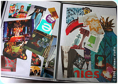
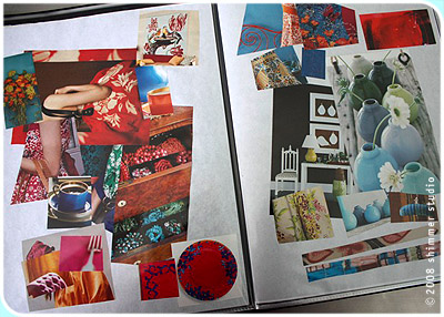
Another method to my madness is how I do color studies. I like to do my color studies by flipping through magazines and pulling out the colors I like and then I glue them in a hodge podge mess and throw them in a sketch book. It looks like controlled chaos but I like doing them this way because I can open a few pages and look at a lot of my personal color picks and see how they interact together at a glance. I do need to focus on doing some more specific color boards right now, specifically a fall color board filled with oranges and reds. I tend toward the cool side so I am going to conciously focus on warm tones. The second color study spread is the one I used for the current Shimmer Studio line of stationery.
Showing posts with label color. Show all posts
Monday, May 04, 2009
color studies
Another method to my madness is how I do color studies. I like to do my color studies by flipping through magazines and pulling out the colors I like and then I glue them in a hodge podge mess and throw them in a sketch book. It looks like controlled chaos but I like doing them this way because I can open a few pages and look at a lot of my personal color picks and see how they interact together at a glance. I do need to focus on doing some more specific color boards right now, specifically a fall color board filled with oranges and reds. I tend toward the cool side so I am going to conciously focus on warm tones. The second color study spread is the one I used for the current Shimmer Studio line of stationery.
Friday, March 20, 2009
Friday, March 13, 2009
A little bit of Green (in the Chicago River)
In the spirit of St. Patrick's Day, which is March 17th, but will be celebrated tomorrow in Downtown Chicago with the annual dyeing green of the Chicago River and a parade, I thought I would post a snapshot from a few years ago (of the River, not the parade). Unfortunately my photo does not really do the color justice. Imagine if you see it in real life as more of a neon green — a freaky bright green.Here's a link to a cool time lapse YouTube video on the dyeing of the river. And this link gives a little bit of background history on the tradition.
I'll be thinking of the green river as I head out of downtown to take a look at a letterpress and letterpress goodies. Woo Hoo!
Monday, March 09, 2009
Thursday, February 12, 2009
Thursday, February 05, 2009
color Inspiration

I love gladiolas. I buy them at the Farmer's markets in the summer. Usually I like to get dark rich colors like purple and red but I find this color combination so refreshing and tranquil right now. It reminds me of summertime and I look forward to spring and summer coming. I love the green with the pink.
Wednesday, October 22, 2008
happy thing SIX: pantone formula guide

My Pantone formula guide is invaluable for selecting and mixing colors for printing! It also helps me with any graphic design projects I may be working on. They are a little pricey and I do need to purchase another one that lets me see the CMYK formula next to the Pantone color. The guides are essentially to help make sure your colors come out predictably. Of course since I hand mix my own inks and I letterpress print instead of offset print my colors will be slightly different from the books but they are still great guides and I usually start with a Pantone when mixing my inks and then customize from there. If you have a pantone book make sure you keep it stored in a dark place. Pantone suggests you purchase a new one each year but if you keep it stored away from sunlight you can usually extend it's life.
Thursday, October 02, 2008
color inspirations
Subscribe to:
Posts (Atom)


